Now I can finally measure how many decibels my kids are screaming at. ?? #WWDC19
This is fast and furious. I love it. #WWDC19
Ok, my baby is asleep, my husband is napping with our toddler: let’s do this. tvOS! Multi-user support! (multi-user all the things please!!) Xbox and PlayStation controllers?! This is already nuts. #WWDC19
Preparing for the macOS 10.15 Beta
A few years ago around WWDC time I made the mistake of installing the fresh new beta of OS X on my only Mac. Shortly after that, I needed to submit an update to one of my apps…only to find out that you can’t submit release builds to App Store Connect (then iTunes Connect) from a beta version of Mac OS. After some furious googling, disabling system integrity protection, and editing some plist that I was undoubtedly not supposed to touch, I tricked Xcode into thinking I was using the previous version of the OS. Lesson learned.
Since then, I’ve waited until September to update my Mac. This year, however, is different. This year is Marzipan.
So, I took to Twitter and asked for recommendations for external SSDs. Several people recommended the Samsung T5 Portable SSD, so that’s what I got. Fortunately it arrived today, just in time to install macOS 10.15 on Monday!
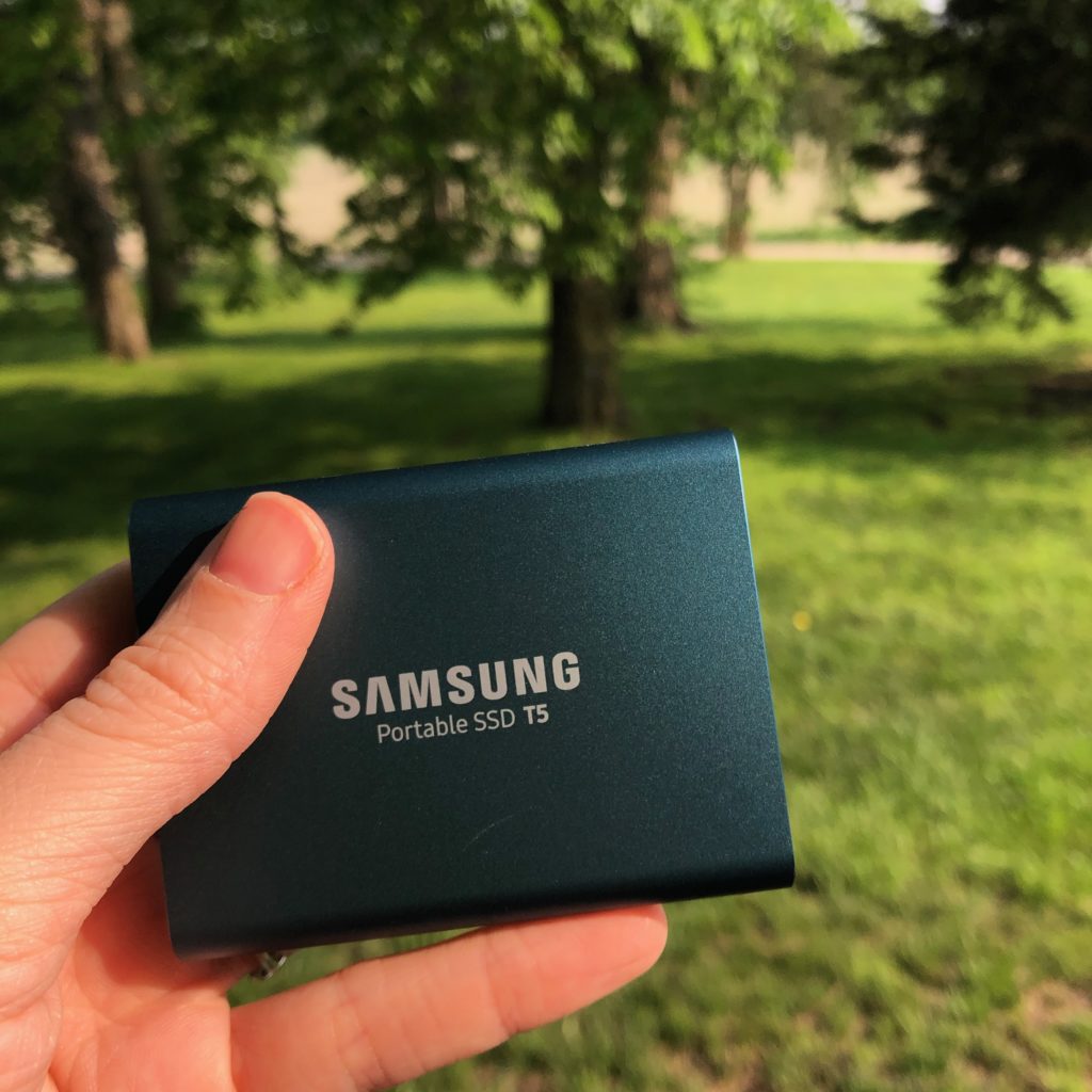
If, like me, you’ve never run macOS from an external drive, I found some very good instructions over at Macworld. I’m looking forward to exploring all the new features (and Marzipan apps!) that macOS 10.15 will bring without worrying about messing up my main development environment. How about you? Will you be installing the new macOS beta next week?
I said it before, but I’ll say it again: Apple’s not going to release a new Mac Pro with like 32 cores and a beautiful new display just so it can run giant dumbed down iOS apps, web apps, and a super sandboxed, “you’re not allowed to touch anything” operating system. ??♀️
Just released an update to Snapthread (version 2.0.2) that automatically converts panoramas to 15-second videos that slowly pan from left to right. Other changes include a button for easily scrolling to the bottom of your photo library, better support for time lapse videos, and miscellaneous crash fixes.
For the past few months I’ve been grumbling about the fact that Apple no longer sells official silicone cases for the iPhone X. My Rose Red one is peeling badly, so I started looking at Apple’s iPhone XS cases (they fit the X, but there’s a slight gap below the camera bump because the XS’s bump is a few millimeters taller). I was about to buy a green one when I thought, why should I buy a $40 case for a phone I may replace this fall?
Browsing Amazon, I found these $12 silicone cases by SURPHY and decided to give one a try. I ordered a yellow one and was surprised when the color actually matched the photo on the product page. What I like most about this SURPHY case (besides the price and the color accuracy), is that there’s nothing printed on it—not even a logo. It feels the same as Apple’s cases and has the same soft lining. If you have an X or an XS and are looking for a cheap silicone case to get you by, I recommend this one!
WWDC 2019 Developer Wishlist and Keynote Predictions
WWDC is now just two weeks away, so I thought I’d share what I’m hoping for in the way of developer tools/APIs.
UIKit Updates
- A standard system font picker
- A standard system color picker
- An easier way to implement multi-column layouts that doesn’t involve nesting UISplitViewControllers
- A keyboard navigation system for iOS that would allow users to navigate table views and collection views using the arrow keys
- Greater variety of stock UI components and customization options for components on iOS (i.e. stop making us reimplement an expanding table view cell with a rotating arrow, or a circular progress indicator, or write dumb hacks like adding a blank UIImage as a navigation bar’s “shadow” just to get rid of that line beneath it)
- More standard system icons that can be used both inside and outside of tool bars and navigation bars (like, on regular UIButtons)
- A visual redesign of all current stock components on iOS, which, in general, are boring, ugly, and inaccessible
- More Apple frameworks classes should be made Codable-compliant (i.e. UIColor).
- I want to be able to force a dark appearance for all elements in my app. Snapthread’s never going to have a “light mode,” but I want to make use of iOS 13’s dark mode appearance for things like action sheets, pop ups, picker views, switches, etc regardless of the user’s display setting.
- A cleaner way to check if a device is in landscape orientation than checking the orientation of the status bar
- Support for rearrangeable buttons in a toolbar/nav bar on iOS
Xcode Improvements
- Interface Builder improvements: basically, every visual customization that is possible for a UI component should be editable in Interface Builder. This includes layer customizations like corner radius, border, and drop shadow.
- There should be more information than just a progress bar when uploading to App Store Connect from Xcode. At least Application Loader tells you the upload speed and how many MBs are left.
- Closing the new Music app should not be a requirement for installing Xcode.
- A way to hide/dismiss warnings in Xcode
Photo and Video
- Developer access to the more recent Apple-made Core Image filters, such as Silvertone, Dramatic, Vivid, etc
- A “What’s New in AVFoundation” session…there hasn’t been one since 2016
- There are rumors that Apple will enable developers to train machine learning models on device. I’d like to see examples of that applied in photo/video contexts.
These are just my wishes… now for a few predictions.
WWDC Keynote Predictions
There are rumors that Apple is planning to grant developers access to its real-time document collaboration API. I think this is going to be a big talking point, along with the ability for apps to have multiple “instances” open at the same time (i.e. being able to compare two Microsoft Word documents in split view on iPad). I’m guessing there’s going to be more than one demo showing off these features, and so my prediction is that Microsoft is going to demo a new Office update, and Adobe will be there to show off real-time collaboration in XD or something like that (somebody’s gotta compete with Figma, right?). Or Affinity maybe? I imagine some sort of photo editor or design/drawing app will at least be shown to demo the new floating panels on iPad.
I have no doubt that Tim Cook, or whoever is doing the watchOS presentation, will mention Apple’s ECG app—how it’s already saved lives and will continue to roll out to more countries. None of the new rumored health apps seem demo-worthy, but there’s rumors of new Siri intents, and I’m betting at least some of those are going to get demoed on the watch—event ticketing, flight/gate information, etc.
I have no clue what third party Marzipan apps we’ll see onstage. Darkroom seems like a good candidate for Mac, as well as Ferrite and LumaFusion. Some weather apps might be interesting, but not that interesting. I’m stumped. Instagram? Instagram for iPad and Mac? (lololol) Games don’t make much sense because engines like Unity already enable devs to make cross-platform games.
Perhaps the biggest mystery of all is how Apple is going to fit all of this into a ~2 hour keynote. Close your eyes for a moment and think these words in Tim Cook’s voice: “iOS 13, with a gorgeous new dark mode…” I mean, you know they’re going to want to spend 15 minutes just talking about dark mode. Judging by Bloomberg and 9to5Mac’s rumor dumps, they’re only going to have about two. There’s just too much to cover. Apple has shown that they can put together a really tight keynote though, so my prediction is that we’ll see another fast-paced, throw-a-bunch-of-features-on-a-slide-and-move-on presentation.
What about you? What are your predictions? Feel free to share your own thoughts/blog posts with me on Twitter @bhansmeyer, or Micro.blog @becky.
Snapthread 2.0 is Now Available!
Snapthread 2.0 is live on the App Store as of yesterday, and so far I’m very happy with how it’s been received. I thought I’d write a bit about some of the new features, and my ideas for the app going forward.
I already wrote about Snapthread’s new data recovery feature, which, to be honest, has lifted an emotional burden that’s been weighing on me ever since I got my first negative review. I feel like I can finally relax and just focus on the cool features I want to add instead of obsessing over every little crash, a few of which have been out of my hands.
Another one of my design goals for 2.0 was to make the app even more user-friendly. It’s possible that Apple will make iOS 13’s default stock buttons look more like…well, buttons… but I didn’t want to wait until June to find out. So, I brushed up on my very basic graphic design skills and got to work making some buttons in Affinity Designer. They have gradients, and drop shadows, and noise, and I think they look nice. The dark gray buttons you see in the app have an image background that has been sliced so that it can easily expand to fit its contents. On iPad, most buttons have both an icon and a text label.

I also moved several buttons to new locations. It bothered me that the top navigation bar had an unbalanced number of icons on each side, so I decided to take two common actions, share and reset, and move them closer to the bottom of the screen. I also heard from some users who wanted a separate “save” button apart from the one in the share sheet, so I added that as well. To regain some space for the video preview, I moved the aspect ratio button to the navigation bar.
Earlier I wrote about how I wanted to refactor the entire app to use container view controllers. Instead of popping up a new modal view controller every time the user selected an editing tool, I wanted to gracefully transition between view controllers by fading them in and out. Now, the app’s main view controller has three containers: a small one at the top for displaying banners and progress bars, a middle one for displaying video content, and a bottom one for displaying various controls. For the iPad version, a fourth container runs vertically along the right side. I’m still working on making the code cleaner (it’s kind of a tangled mess of delegates right now), but it works, and it feels much snappier to me.
Prior to 2.0, there was no way to tell which clip in your timeline was currently playing. Now when you tap the play button, every thumbnail in the timeline darkens slightly except for the currently playing clip. There was also no way to know what a clip’s duration was while you were trimming it…now, there’s a handy label with that information (there’s still more I need to do to make trimming a better experience, but this should help at least a little!). You can now adjust the crop rectangle of landscape and portrait videos when you’re not using letterboxing; previously, that feature was only available if you selected a square aspect ratio. And speaking of square videos: they can now be letterboxed as well. Before, if you added a square video or photo to your project it would force the aspect ratio to be square.

The iPad version now includes a bunch of keyboard shortcuts. A full list of them can be found over at Snapthread’s spiffy new website. One of my wishes for WWDC is for a way to use the keyboard to navigate a collection view. In other words, you could use the arrow keys to say, zip through your photo library and select/preview images and videos. There’s currently no way to implement that (at least that I can figure out), so you still have to reach up and poke the screen to select your clips.
Last but not least, you can now rotate photos and videos, add text overlays, add a bounce effect (from within the Loop tool), and add filters. There’s a mix of Apple’s built-in filters and a few I created myself, named after towns in Nebraska. I also did my best to recreate Apple’s Silvertone filter, as it’s not available to developers (at least not that I could find!). Creating Core Image filters by chaining a bunch of adjustments together is kind of fun, and I definitely plan to add more filters to the list.

I have a long list of improvements to make and features I’d like to add to Snapthread in the future. Some of them I’d like to keep under wraps (just in case they don’t work out, ha), but others are just more basic things you would expect from a video editor: stickers, speed adjustments, an optional Ken Burns effect, etc. I’d also like to make improvements to some of the existing tools before going wild and adding more. For instance, adding text overlays can be a little janky at times. iCloud downloads can be canceled but not restarted, which is frustrating. Trimming could be more precise. The crop tool could allow zooming.
Now, it might be that none of that seems particularly remarkable, and you might wonder why Snapthread 2.0 is a big deal at all, as most video editing apps already have the same basic tools (and more!). It’s a big deal to me because I’m only one person, because I’m still mostly a beginning programmer, and because I really care about it. It might be a big deal to you because it’s one of only two or three apps on the store that merge Live Photos, and now, it’s better than ever. ?
App Store Pricing
App Store Pricing (it’s not a free market!) (2008)
This past week I came across this old post by David Barnard from 2008 and ended up reading it several times (I didn’t really start reading dev blogs until ~2013, so I’m sure I missed many gems like this). Between this and all of the discussion about how Marzipan may negatively affect users’ pricing expectations, I feel…well, I feel fired up, actually.
More than ever I realize that it’s futile to try to compete on price. So if you’re an indie dev, and your non-subscription-based app is priced under $5, I want you to go into App Store Connect and bump that baby up to the next price tier. See what happens. If the world doesn’t end and your sales don’t nosedive, bump it up again. What you’re doing is not evil or greedy, neither is it comparable to Adobe doubling the price of their Photographer bundle. That’s apples and oranges. And if someone says, “I was planning to buy your app at $3.99, but there’s no way I’m paying $4.99,”…forget ’em.
$5 should be the absolute rock bottom price for a quality indie app, full stop. So, for whoever might need to hear this: stop kidding yourself, you’re not going to make it up in volume, raise your dang prices, thank you and good night.
5 Localization Resources for Indie Devs
Let me first say two things. First, these tools aren’t very helpful if you have a lot of text in your app. By “a lot,” I mean long sentences, tutorials, lengthy error messages, etc. Second, my app has enough text that I had to ask for help. I can’t afford translation services, but I have three wonderful volunteers who have helped me make Snapthread available in Spanish, Italian, and French.
That said, I usually find the following resources helpful whenever I attempt to translate single words and short phrases on my own.
1. Babble-on’s “Missing Apple iOS Localization Term Glossary”
A long name for a great resource containing nearly 300 common words and phrases found in iOS apps with translations in the following languages: English, French, Spanish, German, Italian, Portuguese, Japanese, Korean, Dutch, Russian, and Chinese (Simplified & Traditional).
2. Linguee
Linguee is a language dictionary available in quite a few languages. One of the neatest features of Linguee is that if you search for a term, it lists other websites where that term was translated under the heading “External sources.” There it shows a side-by-side of the website’s text in both languages, with your term or phrase highlighted. Linguee warns that these external sources are not reviewed, but you can look at the URLs and judge for yourself. For instance, if I search for “photo library” in the English-German dictionary, I can find instances of its translation on websites from Corel, Sony, Snapfish, and more.
3. Boomerang by Illuminated Bits
Boomerang is an iOS app by Ish ShaBazz and Heidi Helen Pilypas. It helps automate a common task: using Google Translate to translate something to another language, and then translating the result back into the original language, just to double check. I like to use Boomerang as my final check after translating a word or phrase.
4. Apple’s Support Documents
If you’re wondering what Apple calls some of its own features, apps, and technologies in other languages, you might try checking out the help pages at support.apple.com. At the bottom of every page is a country name with a flag icon next to it (mine says “United States”). Selecting it allows you to choose another language to display the page in. Often, the names of features, apps, menus, and buttons will be capitalized, or in a bulleted or numbered list so they’re easy to find.
5. Other Apps: Beg, Borrow, and Steal
Look, being an indie with a shoestring budget is hard. If you’re looking for really common words or phrases like “Exporting,” “Frequently Asked Questions,” or “Restore Purchases,” consider finding a big name app that already did the work for you. This requires a good memory (or a lot of screenshots), as you’ll need to change your device language, navigate through your chosen app, write down (or screenshot) the translation of any strings you need, and then make your way through Settings to switch back to your native language. It’s not for the faint of heart!
Conclusion
If you want to do a really thorough job localizing your app, you’ll probably need to enlist the help of a professional translation service (you might also consider bribing a bilingual friend). A really thorough job would involve translating your app subtitle, description, keywords, screenshots, and every string in your app, including VoiceOver strings. However, if your app is mainly driven by icons and gestures with very little text, the resources and ideas above may be helpful to you!
Data Recovery in Snapthread 2.0
tl;dr: The Codable protocol truly is great for lightweight data storage.
For me, the hardest part about being an app developer has been hearing from users who have lost work (and precious time) due to bugs in my app. Video editing apps in general are notorious for crashing, and I believe it’s partially due to Apple’s poor documentation of AVFoundation and its myriad error codes. There’s also a foggy concept of “media pipelines” that are managed by iOS itself, are used for playing and exporting media, are completely undocumented, and are limited in number based on, from what I can tell, device chip. If you exhaust those pipelines, stuff just doesn’t work. It’s frustrating.
I’ve been largely resistant to the idea of adding project management to Snapthread. It’s an added layer of complexity that feels beyond the scope of Snapthread’s mission to be a light, casual video editor. Perhaps worst of all, it invites a developer’s most dreaded user expectation: syncing. I knew I had to find a way to save users’ work without building a big, heavy data layer.
I decided to explore the Codable protocol, and slowly began conforming all of my model data to it. I quickly ran into some roadblocks, but nothing too serious. First, UIColor and CMTime do not conform to Codable. However, CMTime can be made to comply with a little tweaking, and UIColor just needed a wrapper struct. For title cards, I needed to store a thumbnail image and possibly a custom background image. I tried converting them to a Base64 string and saving them that way, and it worked great!
I decided not to cache any other media files like photos, videos, or music. Instead, I simply save identifiers that will allow Snapthread to refetch them. Since they’ve already been recently downloaded from iCloud (or were already local on device), refetching takes a trivial amount of time. Additionally, nearly all edits a user makes to a video clip are stored as parameters and applied at the time the final video is composited, so no actual permanent changes are made to the original files.
Another problem I ran into was protocols not playing nicely with Codable (because they don’t conform to themselves…whatever that means). I ended up creating some base structs for my protocols as a workaround. I hate adding extra layers of abstraction like that, but it worked, and now all of my model classes like Clip, StillPhoto, and Title, all of which conform to a protocol called Threadable, can easily be encoded from an array of Threadable.
I used a helper class called Storage by Saoud M. Rizwan to easily cache the user’s current project by saving and retrieving a single .json file to/from the Documents folder. Snapthread caches the project every time a change is made and only deletes the cached data when the user saves or shares the video. Therefore, if the app crashes (or is force quit) before the video is exported, it will offer to recover the project when the app is opened again.
I’m really hoping this cuts down on the number of frustrated users. Personally, I don’t mind if an app crashes as long as I can resume what I was doing with little to no effort. This should allow Snapthread users to do that.
Journey to 2.0: Market Appeal
Snapthread’s journey to version 2.0 has been one of gradually broadening market appeal. If you recall, version 1.0 was an extremely niche product, aimed at people who took lots of short, vertical videos and wanted to merge them together. Over time I added the ability to merge Live Photos, and then added support for landscape videos. I thought I’d market Snapthread as a cool app for stitching Live Photos together, but quickly learned that even Live Photos are pretty niche.
Recently, after spending a couple hours studying the top charts in the Photo/Video category, I realized that Snapthread could be a great, useful app for just about everybody. In the reviews of some top video editing apps, users bemoaned shady subscription practices, being constantly nagged to buy in-app purchases, and being asked to give 5-star ratings in order to use features (for the record, it’s impossible for devs to unlock features based on star rating). I don’t do any of those things with Snapthread. In fact, Snapthread doesn’t collect any analytics, store any user data, or contain any subscription options. Just a plain old “premium unlock” IAP and, in 2.0, a tip jar.
Based on my research, I know there are some things I need to do to help Snapthread gain exposure. I need to add “Video Editor” to Snapthread’s name to help it show up in search results. I need to add “slideshow maker” to its keywords, because apparently people are hungry for simple slideshow creation apps. Despite Apple’s guidelines, I need to add device frames and descriptions to my App Store screenshots, because that’s what all my competitors do (including Clips by Apple).
I also need a new elevator pitch. The app isn’t “just” for Live Photos anymore. So what is Snapthread? Snapthread is a simple, casual video editor and slideshow maker that works with videos, still images, and Live Photos. It’s fun, fast, and user-friendly.
So how will Snapthread 2.0 compare to Clips, which is free?
- Snapthread supports multiple aspect ratios (portrait, landscape, or square); Clips only supports square.
- Snapthread imports Live Photos as videos; Clips treats Live Photos as still images.
- Snapthread allows you to mute, loop, bounce, rotate, trim, and crop clips; Clips supports muting and trimming.
- Snapthread doesn’t have project management or an in-app camera.
- Clips has Live Titles, selfie scenes, animated title posters and stickers; Snapthread has non-animated title posters.
- Both apps only support one music track per video.
- Neither app has options for transitions between videos (i.e. wipe, cross-dissolve, etc.)
I’m going to do my best to continue to improve Snapthread with things like stickers and transitions, and the ability to select a specific portion of a music track.
This shift in thinking about Snapthread has been exciting for me, and I’m really looking forward to marketing it as a mass market product.
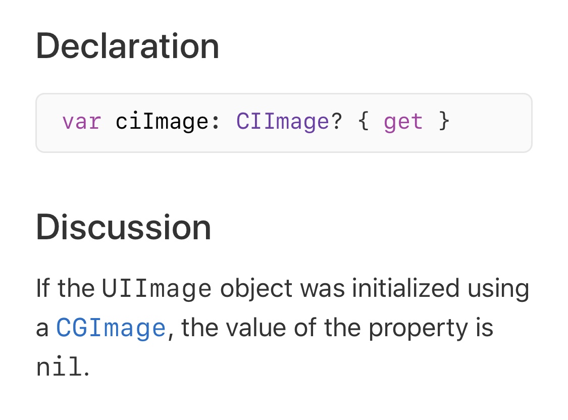
I was reminded how important documentation is today after spending fifteen minutes trying to figure out why a certain code path wasn’t being reached.
If you shuffle between UIImage, CIImage, and CGImage a lot, you might be tempted to access the handy “.ciImage” property of a UIImage. However, that property definitely does NOT have a value if you initialized your UIImage from a CGImage, and you need to use a CIImage initializer instead. Thanks, Apple docs!
Journey to 2.0: Container View Controllers
One of the major structural changes I need to accomplish for Snapthread 2.0 is switching to the use of container view controllers. For those who don’t know, container view controllers allow you to embed one or more view controllers inside a parent view controller, which can then manage transitions between its children. UINavigationController and UITabBarController are examples of container view controllers in UIKit, but you can also create your own.
I’ve never used custom container view controllers before, so of course I hit Google to see what I could find. John Sundell has a great introduction to the topic and I really liked the series by Mike Woelmer as well. (Edit: I also meant to include this fantastic article by Ben Sandofsky) The first thing I learned was that if you want to be able to switch between child view controllers, you should probably set them up in code instead of Interface Builder, which only allows a single embed segue between parent and child. I wasn’t ready for that though, so I decided to take a baby step and find a situation where a single parent-child relationship made sense.
Snapthread’s main view controller is…well, massive. I’m too embarrassed to tell you how many lines of code it is, but after combing through it, I realized at least 400 lines were devoted to setting up the AVPlayer, handling play/pause events, observing the status of the current AVPlayerItem, scrubbing, adding the watermark, etc. Clearly, the video player was a good candidate for having its own view controller.
So, I created a VideoPlayerViewController class and began copy and pasting everything relevant to setting up the AVPlayerLayer, displaying time elapsed/remaining, scrubbing, etc. In Interface Builder, I added a new view controller and copied over the video preview view, which is a custom UIView class that resizes its own AVPlayerLayer, and the player controls.
I deleted the video player and controls from my main view controller and replaced it with a container view from the Object Library. I hooked it up to my new view controller using an embed segue.
Next, I had to figure out how to communicate between my main view controller and the video player. Communicating between the player and its parent was easy; I just set up a delegate with methods for responding to changes in AVPlayerItem status and duration (if it exceeds a certain duration, the UI displays a warning that the user needs to purchase Premium in order to export). I set the delegate using prepare(for segue:), which is called when the child VC is embedded.
There were times when I needed to tell the player to do something from the main view controller, however, such as hide its controls or clear its watermark. I wasn’t quite sure how to handle that. Using notifications was one option, but it just didn’t feel right for some reason. I ended up storing a reference to my VideoPlayerViewController and referencing it directly. That’s probably bad practice, but I’m pretty sure it’ll be okay, as I don’t plan on using that particular video player with any other view controller.
Overall, I feel slightly more comfortable using container views now, and I think I’m ready to tackle the next step: transitioning between child view controllers. I plan to post more about new things I’m learning; each of those posts will be prefaced by “Journey to 2.0” if you’re interested (or want to ignore them, lol).