Happy New Year! ? I hope 2019 is off to a good start for you. I’ve been slowly getting back into coding since my daughter was born, sneaking in 30 minutes here and there in the evenings after the kids are asleep. I’m hoping to get Snapthread 1.9 submitted soon; it contains bug fixes, rudimentary support for still photos, the ability to loop clips, and makes the app compatible with the new iPad Pro screen sizes.
That said, I’m already thinking about Snapthread’s big 2.0 update. I don’t usually do “major releases” because I prefer to get new features out quickly, but now feels like the right time to slow down and really do a lot of work and polishing. A big update also invites more press coverage, is an opportunity for marketing, and can get Apple’s attention…gotta work toward that Apple Design Award, you know. ?
My design goals for Snapthread 2.0 are simple and twofold:
Improve accessibility. This will involve making my buttons even more button-y and using text labels in addition to icons for added clarity.
Consolidate functions. Currently, every tool for editing a clip opens up its own modal view, with its own video preview. My goal is to make the clip editing interface more modular, swapping out tools below the same preview so that all editing (muting, cropping, trimming, looping, etc.) happens in the same view controller.
There are many more additional improvements that I’m hoping to cram into 2.0…but we’ll see. Some of them include: video transitions, the ability to add text to clips, Ken Burns effect for still photos, non-buggy support for time-lapse and slow motion videos, and auto-saving of recent projects to guard against losing work. I also want to continue improving the title card selections.
In order to finish 2.0, I’m going to need a good task management app. After watching the beta evolve over the past year, I believe Capsicum by Illuminated Bits may be the best app for helping me accomplish my goals this year. My next post will be all about how I plan to use it!
Um, so, yeah. A bunch of great iPad Pro reviews/impressions have trickled out over the past few weeks—so many in fact that I was hesitant to even write my own. I agree with much of what has already been expressed: the hardware is great, the software has numerous pain points, and the answer to “can this device replace your laptop?” is the same as it’s always been, which is “yep, maybe, probably not.” Yep for a ton of people that use computers for light work and entertainment, maybe for professionals in certain fields or with particular priorities and workflows, and probably not for the rest.
As an iOS developer, I’m forced into the “probably not” category until something resembling Xcode makes its debut on iOS. However, as a blogger, amateur photographer, and consumer of fine internet content (gross, sorry), the iPad meets my needs just fine. Here’s my thumbs up/thumbs down for the third generation iPad Pro.
My Config
I ordered a 12.9” Pro, 256GB Wi-Fi only model in silver to replace my iPad Air 2. I also bought an Apple Pencil, Smart Keyboard Folio, and an additional rose gold case made by Ztotop which, for $30, is really pretty darn good. It’s sturdy, attaches via magnets like Apple’s cases, is as thin as possible, and comes in colors other than black and white.
Thumbs Up ??
As a stay-at-home mom with a two year old and a two month old, the device I use as my primary computer has become a matter of accessibility. What allows me to sneak in tasks quickly? What can I carry around easily with one hand? What makes me seem more approachable and doesn’t create a physical barrier between me and my kids? An iPad is the best fit for this season of my life, so I’m overjoyed that Apple’s latest offering is smaller and more capable than ever.
First off, this device is aces for editing photos. I helped my sister-in-law “fix” her family Christmas card photo this year by lengthening someone’s shirt to cover their midriff. The Apple Pencil made a precise edit like that ridiculously easy. I also edited our own family Christmas card photo, as well as an entire photo book’s worth of pictures of the kids to send to my parents. I know someone’s said this before, but it almost feels like working in a darkroom, dodging and burning the old-fashioned way.
Yesterday my mom asked for a picture of the kids in their Santa jammies in front of the Christmas tree. It worked out better for me to snap a quick portrait of them during the day, but I still wanted to add some colorful bokeh from the tree at night (at which point I sadly realized my camera lens does not create perfectly round bokeh). I used Affinity Photo on my iPad to create this composite, which, while far from perfect, is still pretty cute:
Penny was less than enthused
Messing around with photos on my iPad has made me dream of an iPad model with an even better camera than the iPhone line-up. A “medium format” camera, if you will. Maybe Apple could even offer its own magnetic lens attachments. Shooting and editing using the same big, gorgeous display would be kinda cool I think. /end dream sequence
iOS 12 has improved the experience of transferring photos to an iOS device by leaps and bounds. It used to take forever to load hundreds of thumbnails from an SD card. Now, it’s really pretty snappy. I took a ton of photos at our family Thanksgiving with my Canon DSLR and within seconds was skimming through them on my iPad using the SanDisk USB-C card reader I bought for my MacBook Pro.
My favorite photo editing apps at the moment are Lightroom, Snapseed, and Affinity Photo. I’m also looking forward to the recently-announced Darkroom for iPad, which is currently in beta. Photoshop coming to iPad is more exciting for the role it might play in shaping the OS’s future than for its actual features.
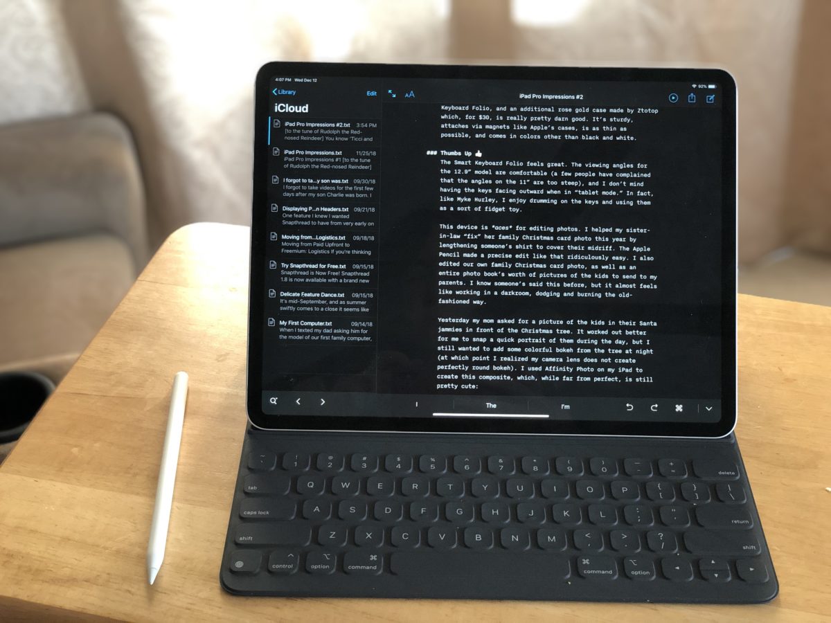
Writing on an iPad Pro is pleasant. I’m currently typing this post in iAWriter using the Smart Keyboard Folio. I like the feel of the folio’s keys, and the dull “thwop” they make when you press them. The viewing angles for the 12.9” model are comfortable (a few people have complained that the angles on the 11” are too steep), and I don’t mind having the keys facing outward when in “tablet mode.” In fact, like Myke Hurley, I rather enjoy drumming on the keys and using them as a sort of fidget toy/musical instrument. (Where do I pick up my #MykeWasRight sticker?)
There’s a lot more to like about the iPad Pro, especially if you’re upgrading from an iPad Air 2 like I did. The display is top-notch, ProMotion is one of those things you don’t understand how you lived without, and the Apple Pencil is downright magical. It’s much heavier than the Air, of course, but still light enough to comfortably pick up with one hand. If you love iPads, don’t own last year’s generation, and have the dough: what are you waiting for? You should buy one.
Thumbs Down ??
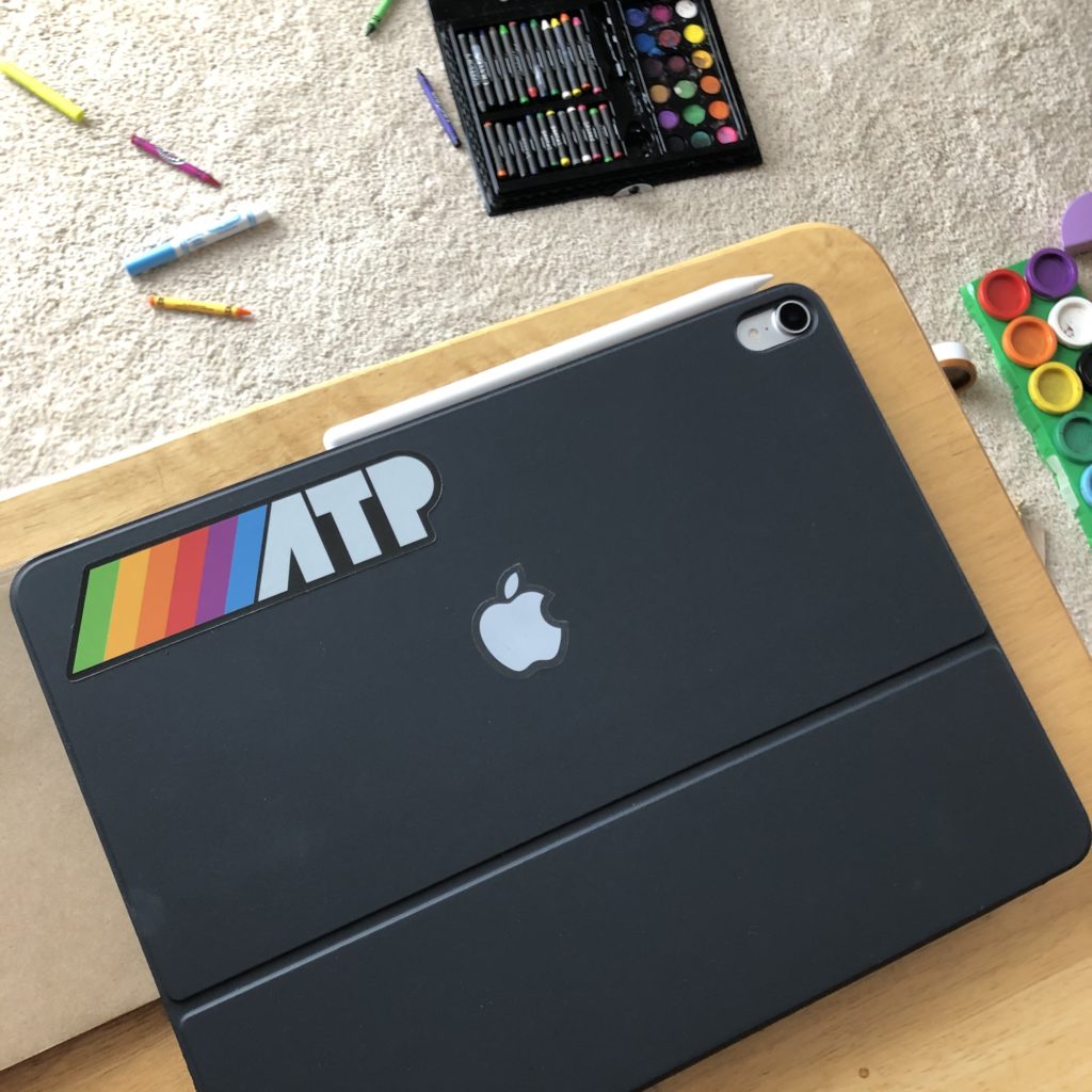
Look, I’ll be straight with you. This keyboard case is boring as heck. I ended up sticking a small Apple logo sticker on one side along with an ATP sticker to spruce it up a bit. The lack of color options (and case options in general) made me pretty crabby on pre-order day and honestly, I’m still pretty annoyed about it. Like, what is Apple thinking? The creative professionals they’re seemingly targeting with the iPad Pro line are exactly the kind of people who like to buy unique accessories that fit their personality. I just don’t get it.
This is what life with a two year old looks like.
There’s actually very few things I need to do that I can’t do on my iPad. In fact, I can rattle them off rather quickly: I can’t use my preferred banking app, Banktivity, because its iPad app doesn’t allow me to import OFX files; I can’t compare or copy and paste between two Microsoft Word documents side by side (or have multiple tabs of any app besides Safari); I can’t create a slideshow for my church’s weekly service because the presentation software, Proclaim, doesn’t have a full-featured iOS app; and finally, I can’t work on Snapthread.
Of course, there are also a number of tasks that are just plain clumsy on iOS, like discovering keyboard shortcuts (and, as John Gruber recently pointed out, basic functions like “Undo”), shuffling files between apps, managing fonts, and multitasking. All of these things can be improved via software update, and hopefully iOS 13 will address at least a couple of them (though I don’t know about you, but I’m trying to temper my expectations for June).
It’s clear to me that I’ve only scratched the surface of what the iPad Pro can do. Some of that is because the device’s performance potential exceeds its software’s capability. Most of it, however, is that I just don’t know what I’m doing. Matt Cassinelli’s video on iPad gestures is somewhere on my “watch later” list, but aside from that I feel overwhelmed by the number of iPad productivity tips out there.
On a Mac, you can poke around in the menu bar and find all sorts of interesting and useful functions. On an iOS device, exploring isn’t quite as easy, and functions are far from consistent across applications, making it much more difficult (in my opinion) to become an iPad expert than a Mac power user. That’s frustrating.
And then there’s this: to really thrive, the iPad needs a richer ecosystem of pro applications. Besides filling the obvious holes in its software line-up like Logic and Final Cut Pro (also Aperture 4ever ❤️), Apple needs to offer developers more capable APIs and continue to improve its App Store guidelines and practices.
For example: improve the revenue split, aggressively purge scammy apps from the store, stop nitpicking every little thing from developers with a good track record (alternatively, make the guidelines more clear), continue to explore new business models, and make it a helluva lot easier for developers to implement subscriptions. To an outsider like me, this doesn’t seem like rocket science. Perhaps it’s just poor organization, or utter cluelessness, or maybe it’s a stubborn unwillingness to even acknowledge (let alone address) these issues because it might negatively affect the bottom line. Whatever the case, it’s holding iOS back.
I long for a day when iPad reviews aren’t by necessity reviews of iOS. A day when we’re just bickering over specs, colors, ports, and keyboard layouts. Some say we’ll never see such a day while Tim Cook is at the helm. I prefer to remain optimistic. 2019 will be the year, I just know it. 2019, y’all. You’ll see.
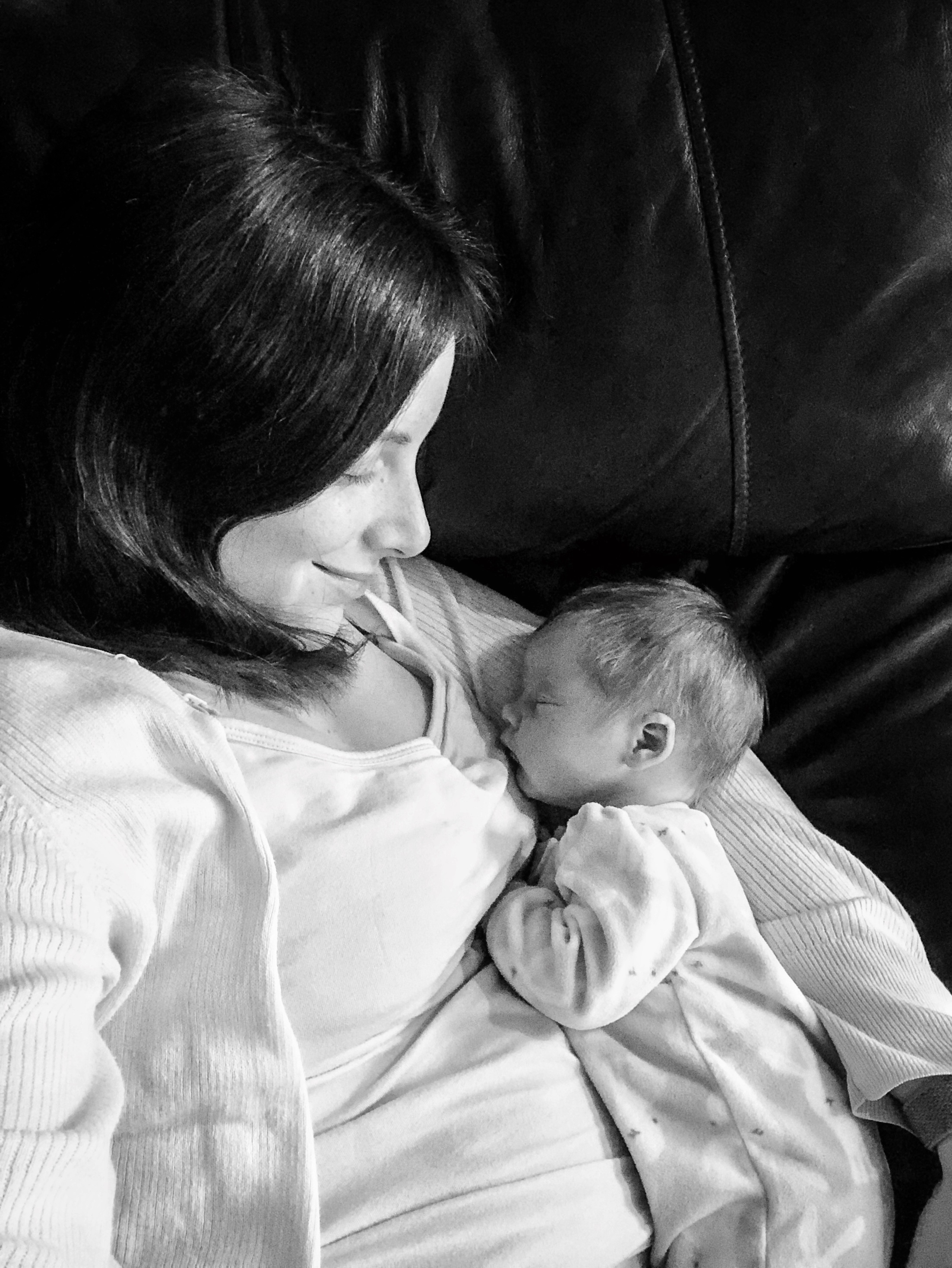
Nothing reminds me of the steady, relentless march of time so acutely as having a newborn baby (well, except maybe having a blog that I don’t update often enough ?).
Penelope Rose Hansmeyer was born on October 15 via a scheduled cesarean section. For those interested, she was 7 pounds, 8 ounces and 19 inches long. Everything to do with her birth went incredibly smoothly—a stark but welcome contrast to my son’s birth two and a half years ago! And speaking of Charlie: he’s adjusted really well so far to having a baby sister. He calls her “Baby Penny” and likes to pet her hair (which, holy cow, she has a lot of hair!).
I’ve been incredibly blessed not to experience some of the darker challenges of motherhood, such as postpartum depression and difficulties with breastfeeding. Charlie was a terrible sleeper which resulted in us co-sleeping for over two years, and I guess time will tell with Penny, but overall I just feel overwhelmingly happy with my little family and our humble little life.
I just looked back at my post about Charlie’s birth and realized he was born shortly before the Apple special event which introduced the iPhone SE and 9.7″ iPad Pro. It’s fitting, then, that Penny was also born shortly before a special Apple event. I didn’t quite get my order in before the shipping dates slipped, but I’m looking forward to receiving a silver 12.9″ iPad Pro with Apple Pencil sometime before the 20th. It sounds like an amazing upgrade from my iPad Air 2, and I can’t wait to share my impressions with you.
In the meantime, though, I’m gonna cuddle with this little pumpkin. ?
I forgot to take videos for the first few days after my son Charlie was born. I made sure to pack a couple nice cameras in my hospital bag, and recall struggling against the harsh lighting in my recovery room (not to mention the constant stinging of my incision) to snap some semi-decent photos of my new little bundle. It felt like enough at the time, though now I wish I had done a little more.
Maybe I should have shelled out for the professional photographer. I definitely should have insisted my husband take more pictures of me holding Charlie. And I should have taken some videos, too. Over the past two years countless friends have had babies, and many of them took videos of some of their earliest moments. I find myself wishing I had done the same.
In a way though, I did. I was using an iPhone 6s when Charlie was born. I took a few photos of him at the hospital to easily send to family and friends, and of course took many [thousands] once we finally got home. I’ve always had Live Photos enabled, so each one of those snapshots recorded a tiny 3-second clip.
The clips are shaky, low-quality, and mostly lack sound (because the little guy was sleeping), but there’s just something about them. I’m glad they’re there. They add some “concreteness” to a time of my life that seems like a blur, in a way that a photo alone couldn’t quite accomplish.
When I’m considering how to record a moment, I almost always favor photographs over videos. After all, you can’t really hang a video on your wall. Live Photos make that choice even easier, and with an app like Snapthread, I can still salvage a great moment from a sub-par photo.
My hope for the future of Live Photos is that we won’t have to choose between taking the highest quality photo and capturing those precious little videos. Having portrait mode and adjustable depth data is amazing, but hearing my little boy’s laugh years later is perhaps even more so.
If all goes according to plan, I’ll be going in for a scheduled cesarean section two weeks from tomorrow and we’ll finally get to meet our little girl. You can bet I’ll be taking even more Live Photos (and longer videos too) this time around.
If you use Snapthread to share some of your favorite moments publicly, I’d love it if you’d use the hashtag #snapthread or tag @snapthread (either on Twitter or Instagram) in your post so I can find them. And if you’ve written an article or blog post about how Live Photos in general have affected your life, I’d love to read that too!
One feature I knew I wanted Snapthread to have from very early on was the ability to display a user’s photo library in a similar way to the native Photos.app: scrolled to the bottom, sorted by Moment, with selectable sections. What I ended up implementing is actually closer to the Photos app within the Xcode device simulator: it can’t “zoom” in and out of Moment clusters, but it can display assets organized in sections by location and date.
I created a sample project to demonstrate how I did that and put it on GitHub. This is the first time I’ve ever shared code on GitHub, and I know it’s not particularly good, but if you run the project on your device you should see just what I described: your most recent photos and videos at the bottom of the collection view, sorted by Moment. The project loads the user’s first 25 Moments immediately, and then performs a background fetch for the rest, refreshing the collection view only if the user scrolls to the top of the currently loaded content.
There might be much better ways to accomplish this. I welcome any feedback!
If you’re thinking about switching your app’s business model from paid upfront to freemium and, like me, have no experience working with servers, I’m here to tell you that local receipt validation isn’t as horrible as it seems.
If you’re unconcerned about piracy and simply want to check to see which version of your app was originally purchased, I highly recommend following this tutorial by Andrew Bancroft: Local Receipt Validation for iOS in Swift From Start to Finish. What I did was skim through each step of the tutorial first to see what was involved. Then, I grabbed Andrew’s code from GitHub and read more carefully through the tutorial, copying files from his project to mine as needed.
Andrew’s tutorial doesn’t go into detail about how to check for original app version, which is why I’m writing this. Hopefully someone will find it useful!
Every time Snapthread’s main view controller loads, it runs a function called checkIAPStatus(). Here’s what that function does, in pseudocode:
if the “purchasedPremium” UserDefault has been set, don’t do anything because everything is already unlocked
else if a UserDefault that I set in the previous release of Snapthread called “originallyPurchasedPaidVersion” is true, unlock everything and set the “purchasedPremium” default (this covers users who paid upfront and have used Snapthread recently enough to have had the default set)
else retrieve and validate the receipt using the ReceiptValidator class created in the tutorial (it returns a ParsedReceipt struct if successful) and examine it for originally purchased app version
NOTE: One of the most important things to remember is that the receipt doesn’t list the original App Store version number that was purchased (such as 1.0, 1.1, etc.). Instead it lists the original build number. So you’ll have to note the final build number of your paid upfront version and check against that.
When you ask your ReceiptValidator to validate a receipt, it returns an enum that may or may not have an associated value (either .success, with a ParsedReceipt struct, or .error). So you can do a switch statement on the result, and do something like case .success(let receipt): to grab a reference to the associated ParsedReceipt so you can look at it.
The originalAppVersion property of the ParsedReceipt struct is a String, so you’ll want to convert it to an Int in order to do a less-than comparison.
The only real downside, in my opinion, to doing local receipt validation using Andrew’s method is that it uses OpenSSL, which requires you to disable Bitcode in your project because it doesn’t support it. Disabling Bitcode is easy, but can cause you to get a weird e-mail from the App Store after uploading a build telling you you’ve got extra symbol files, or something like that. It’s just a warning and doesn’t prevent your build from going through or anything, but I was confused by it.
So far I haven’t received any complaints from previous purchasers who can’t export long videos or are seeing a watermark, so I’m guessing I must have done something right!
Snapthread 1.8 is now available with a brand new business model and a gorgeous new icon designed by the incredibly talented Michael Flarup. The update includes mostly minor improvements, including the ability to select entire “Moments” of photos in one fell swoop as well as a button for quickly generating a video from your most recent photos.
There’s something about having a truly great icon that’s made me feel more dedicated to Snapthread than ever. There are so many improvements I still want to make as well—enough to keep me busy for a long, long time. In a way it’s become a sort of playground for me to practice and develop my programming skills, and I love the endless challenge of improving it.
Anyway, I hope you’ll consider giving Snapthread a try. You can use all of the app’s features for free with only two limitations: a watermark in the lower left corner and a 30-second limit for video exports.
Here are three things you can do quickly and easily with Snapthread:
Stitch together Live Photos of your kids, pets, latest vacation, etc.
Combine portrait videos for IGTV
Mix Live Photos and regular videos together
Thanks for all of your support, and extra special thanks to my awesome beta testers and translators. I couldn’t do this without you!
It’s mid-September, and as summer swiftly comes to a close it seems like a great number of other things are wrapping up in my life as well. The crops are nearly ready for harvest, I just submitted version 1.8 of Snapthread, and in exactly one month we’ll be welcoming a new addition to our family. Apple is busy wrapping things up as well, having debuted its new iPhone and Apple Watch models this past Wednesday, and preparing to release iOS 12 to the public this coming Monday (and macOS Mojave the following week).
As I watched Wednesday’s keynote, I was intrigued by the decisions Apple made regarding the iPhone lineup, particularly the differences between the iPhone XR (this is where I remind your brain to pronounce it “iPhone TEN ARRR”) and its considerably more expensive counterparts. I’ve been thinking a lot lately about “driving conversions” and how to nudge people to make certain buying decisions. Snapthread is becoming a freemium app on Monday, and as anyone who follows me on Twitter knows, I had a hard time deciding what features to gate off from my free customers.
Apple had to figure out where to draw that magic feature line too. The way I see it, if you have two models of the same product, a cheaper entry-level model and a premium one, you have two choices: present the cheaper one first and position the premium one as “this model has everything the first model has, PLUS all of these other must-have features,” or present the cheaper one second, and explain what features are missing, which kinda gives off a “sad trombone” vibe for anyone who can’t afford a >$1,000 cell phone. I’m fascinated that Apple chose to do the latter, and with a twist even: the iPhone XR is actually more compelling in some ways than the XS and XS Max. It has longer battery life, it comes in more colors, it has a bigger screen than the XS, all while sacrificing…what? Optical zoom and 3D Touch? An OLED screen? This phone is clearly meant for the masses.
It made me wonder what purchasing decision Apple is trying to drive customers to make, until I realized: they probably don’t care. Like, at all. Because regardless of which iPhone model turns out to be the breakout star of 2018, their average selling price goes up, up, up. My guess is that in the United States, the iPhone XR is going to sell like hot cakes. Everybody and their brother and their middle schooler is going to want one of those suckers, probably in yellow or orange.
Overall, the event made me even more excited for the iPad and Mac announcements likely coming in October. Will Apple make similar decisions with the MacBook lineup? Just like iPhones, MacBooks have gotten gradually more and more expensive. Will Apple make their entry-level laptops so fresh and compelling that choosing between them and a MacBook Pro is somehow more difficult? And what about iPad Pros? Certainly they’ve got more up their sleeve than just FaceID and edge-to-edge displays (or really really slim bezels, for the pedantic). It’s all very exciting, and if I weren’t having a baby in ~4 weeks I’d say the October event is the one thing I’m most looking forward to this year.
In the meantime, I ordered an Apple Watch Series 4 (GPS) in silver aluminum and a tangerine sport loop, which should arrive this Friday. There was something bittersweet about setting an alarm on my Series 0 for 1:59AM so I could order its replacement; on the other hand, I’m definitely looking forward to the enormous difference in speed and features I’ll get with the Series 4. I’m also looking forward to seeing what I can do with Siri Shortcuts to manage life with both a toddler and a newborn.
My list of potential blog topics continues to grow, so expect to read more from me soon!
It’s been quite a summer. This pregnancy has been pretty miserable compared to my first; a combination of loosening ligaments and chronic lower back/hip issues has made walking extremely painful, and it’s been hard for Charlie to understand that I can’t play with him exactly like I used to. On the other hand, baby is healthy and the end is in sight with only 8 weeks to go!
Snapthread’s revenue dropped off considerably about two weeks ago, so I’m particularly eager to transition to a freemium model to see if that helps. In the free version you will be able to export videos up to 30 seconds long, with a watermark. You can create a longer movie and preview it, but if you try to share it, you’ll get a prompt to upgrade (before that there will be a noticeable warning in the UI when the duration limit is exceeded). This approach will give people a good sense of what the app can do, and while I realize I could probably get a higher conversion rate by being a little more limiting, I’d rather attract and retain a large user base. With all of the feature ideas I have, it’s very possible that more things will wind up behind the paywall in the future.
Speaking of features, I thought I’d list some of the things I’d really like to add to Snapthread as time goes on. Some of these I’ve mentioned before and others are new ideas.
The ability to add text and stickers to clips
The ability to select a specific section of a song
The ability to adjust the crop rectangle of clips for any aspect ratio, not just square
Support for still photographs (ideally with a Ken Burns effect)
Basic video adjustments: contrast, brightness, saturation, color balance, etc.
An option for at least one type of transition (fade, dissolve, etc)
A simpler way to loop a video multiple times (this is currently possible by just adding the same clip more than once)
The app should cache the most recent project so it can be restored in case of a crash
A way to “intelligently” auto-generate a video from a recent Moment
Honestly, that’s probably a couple year’s worth of features right there, at the rate that I’m able to work on it.
I once stated that Snapthread’s mission was “to provide the fastest, most intuitive way for people to merge Live Photos and videos for the purpose of compiling and sharing their memories,” and to that end I want to make sure that any features I add don’t clutter up the interface. It will be a careful balancing act but I already have plans to streamline the clip-editing UI so that it’s easier to perform multiple edits quickly.
Anyway, I feel like I’m just rambling now, so: look for Snapthread 1.8 to arrive around the time iOS 12 is publicly released (with a pretty new icon, too!). After that, it’s anybody’s guess as to when I’ll be able to get another version out (besides bug fixes) because Baby Girl Hansmeyer will be here October 15th!
Here’s two opinions. They aren’t necessarily my opinions, but I know many of you share them.
The visual design of iOS has grown stale and is in need of an overhaul.
Marzipan apps, while better than Electron apps, still don’t feel like they “belong” on the Mac. They don’t feel like “real” Mac apps.
Let’s talk about these things.
I think iOS 7 was an important design reset for iOS. I also think that it’s taken WAY too long to walk it back, in terms of intensity, to something more reasonable, accessible, and beautiful.
Before the rumor broke that iOS 12 was going to focus primarily on stability and performance, I think many people, including myself, were hoping for a major UI makeover. In addition to a system-wide dark mode, some folks were hoping for a fresh look for first party apps like Reminders and Notes, and others wanted to see updated appearances for controls like UIButtons, UISwitches, and UIPickerViews.
I’ve watched a good number of WWDC 2018 sessions and if I had to pick an overall theme for this year’s conference, it would be “Delight Through Interactions.” So many of the sessions are all about how we can make our apps better by leveraging fluid, reversible, and interruptible gestures and animations, how we can extend them by making them more useful across platforms, and how we can improve their performance by writing efficient code that scales. (Note: I could have selected like five different sessions to link to for each of those phrases. I just picked my favorites)
Hmm. A focus on delightful gestures, low latency transitions, and cross-platform usability? That almost sounds like Apple is working on some special new hardware. It also sounds like its preparing us to port our apps to Marzipan. In the absence of major API changes and with the focus on how apps should behave, we’re left wondering whether or not Apple still has the same opinions about how apps (and the OS as a whole) should look.
Here’s my theory: Apple is working on a significant design overhaul for iOS 13, and it will address many of the issues people currently have with Marzipan.
Why did macOS get Dark Mode before iOS? That’s weird, right? These days, macOS typically follows in iOS’s footsteps. On the other hand, why should Apple designers waste time creating “dark” versions of every UIKit control now when they’re just going to have to re-do it to match iOS 13’s new look?
Anatomy of a Mac App
Tuesday morning I asked Twitter what makes a Mac app a Mac app. I was genuinely curious, because I’ve been using Macs for 15 years and didn’t feel like I had a complete sense of what differentiates a native app from a non-native one. Greg Pierce (developer of Drafts) helpfully referred me to a section of Apple’s Human Interface Guidelines that lists four main characteristics of a Mac app: flexible, expansive, capable, and focused.
I got many other answers as well, including one that referred me to a list that Steve Troughton-Smith crowdsourced a few days ago. Here’s that list, plus a few extras in bold:
Menu bar and window toolbars
Sidebar/source list
Preference windows
Touch Bar support
Contextual menus
Tooltips
Multi-column tables
Field editors
AppleScript
Tabbed windowing
Multiple windows
Standardized color picker and font panels
Pop-up menus
Time machine/versioning
Compact control sizes
Resizable split views
Outline views
File-system access
Scroll bar elasticity (often missing in non-native apps)
Selectable text where you would expect
Customizable toolbars
Honors general system preferences (e.g. button color prefs) and default apps
“Other Mac-like elements that can be used by iOS apps on macOS are contextual menus, the menu bar, translucent sidebars (such as the one in the News app), window toolbars and the Touch Bar. These elements have been exposed to the iOS apps through new classes in the version of UIKit available on the Mac.”
That knocks a few items off the list, at least! Many of the other things listed would greatly improve iOS apps as well. After all, there’s nothing that should prevent iOS apps from also being flexible, expansive, capable, and focused. Which brings me to…
WWDC 2019
Here’s some things I’m hoping to see at WWDC 2019:
UIFontPicker
This could be in the same, hopefully refreshed, style as UIPickerView and UIDatePicker. There could be a standard version that would automatically list all installed fonts, with a way to customize which fonts are listed. This could be easily hooked up to a label or text view as well.
UIColorPicker, UIColorPickerController, and UIColorPickerDelegate
UIColorPicker would be more modular and would require manually setting up a delegate. UIColorPickerController would contain the boilerplate delegate methods and would be an entire view controller dedicated to color selection.
iOS Time Machine versioning support
This might be too much to ask for next year, but I’m imagining this being announced at the same time as a new hardware accessory similar to the AirPort Time Capsule that would enable wireless iOS backups to a local physical drive.
iOS support for rearrangeable UIButtons in a toolbar/nav bar
This could be as simple as a new boolean: isMovable. I’m guessing UIButtons and UIBarButtonItems are going to look a heck of a lot more like buttons in iOS 13.
Auto-generated tooltips
Tooltips in Marzipan apps could be drawn directly from accessibility hints or labels.
Consistent, system-wide, default keyboard shortcuts for iOS
I don’t even use a hardware keyboard with my iPad, but this still pains me to think about.
Dark Mode
Oh, and maybe the custom accent colors from Mojave? Because why not?
Final Thoughts
I noticed some fussing about the scaling of apps ported to the Mac using Marzipan, which are apparently rendered at 1.3x and downscaled, or something like that. I’m guessing that’s going to become a non-issue eventually, between the iOS redesign which may allow for a smoother translation between touch-optimized and mouse-optimized (compact) controls, and the likely-to-be-increased screen resolutions of new devices released this September. But what do I know? (Hint: not much, lol)
Anyway, I’m really excited about Marzipan. I think it’s a great idea, and I can’t wait to see what waits for us in Phase 2 of the project and beyond. Ultimately, I think it will make both iOS and macOS more useful, powerful, and delightful, without taking away anything that people love from either platform.
What do you think? Will iOS get a re-design next year? Will the Marzipan project ultimately improve both macOS and iOS in tandem? Feel free to share thoughts with me on Twitter, or better yet: write your own blog post.
With the recent launch of The Developers Union there has been renewed discussion about whether or not Apple should allow developers to offer free trials of their apps on the App Store. I wanted to offer a few thoughts from a beginner’s perspective.
My app, Snapthread, is a utility. In general, utilities aren’t great candidates for subscription pricing. So while devs do have the option to offer a free trial for their subscription-based apps, the only way to offer a trial experience for paid upfront apps is to implement some type of in-app purchase to unlock full functionality or upload a separate, “lite” version to the store. There’s really no good way for non-paying users to experience your app in its full glory without significant compromises.
The in-app purchase method works well enough for a lot of folks, especially if they implement it from the beginning. Unfortunately, Snapthread has been a paid app since it launched, meaning it has a chunk of users who have already paid for its features in full.
If I want to switch to a reduced functionality, in-app purchase model, I have a lot of hoops to jump through. First, I have to decide what goes behind the paywall. Do I add a watermark to the videos? Do I limit the number of clips the app will merge at one time? Once I choose and implement some restrictions, I then have to write a bunch of in-app purchase code to remove them.
But what about those users I mentioned who have already paid for Snapthread? For them, I have to perform receipt validation. There are two options: to validate receipts locally on device, which requires some sort of cryptography-related mumbo jumbo that I don’t understand, or validate using my own server.
Look, I don’t have any computer science background. I can barely describe to you in my own words what a server even is, let alone set up my own. I’m not saying Apple should make this easier just for someone like me. I’m under the impression that all of this is a pain in the butt even for people who understand it perfectly well. (A quick note: this isn’t a request for explanations regarding receipt validation. If you have a beginner level tutorial you’d like to send my way, that’s fine, but otherwise I’ll be okay. Really.)
What I’m saying is: Apple could make this a heck of a lot easier on everyone by allowing for time-limited free trials. There could be a simple list in Settings of all the trial apps you’ve downloaded, and how much time you have remaining on each. When a trial expires, maybe you’d see a pop-up when you launched the app asking if you’d like to buy or delete it. If you chose to delete it and later returned to its App Store page, there would no longer be a trial option.
Developers could choose from some pre-set trial lengths, and trials in general would be completely optional. It would take a lot of work on Apple’s end to do this—to bolt this on to the App Store’s crusty old backend. But holy cow would it be helpful for folks like me!
An interesting question for discussion: if Apple did something like this, should users be allowed to submit app ratings or reviews during the trial period? Can they do so now, with subscription trials?
Yesterday I realized that I would really love a standalone app for publishing to Micro.blog that was focused on WordPress. The app itself would be structured very simply: it would open to a list of posts that you have published to Micro.blog (so, this could be all of your posts, or just your “microblog” category depending on how you have it set up). From there, you could edit or remove posts, with the option to remove them from both WordPress and Micro.blog. You could also filter the list by drafts, published, and scheduled, and, of course, write a new post.
The post editor would be very WordPress-centric, allowing you to add tags and assign categories and post types.
Basically what I want is the official WordPress app’s post editor combined with a list of my own Micro.blog posts. No timeline, no replies, just my own personal stuff.
I don’t have time to make this, and I’m not sure the audience for it would be very big. I’m sure most people prefer the combined publishing/timeline viewing experience. I think there could be a place for a focused, clutter-free blogging app though. Preferably with a sweet dark mode, Markdown support (for people who use it–I don’t), rich text or HTML support, and a way to get photos/images to and from your WordPress site’s media library.
Actually, now that I read through that list of features, I’m pretty sure my iOS development skills aren’t advanced enough to even make something like this. But, a girl can dream, right?
I’m very glad to finally be able to share this good news publicly: my husband and I are expecting our second child in October! ?
We’re so excited to become a family of four (plus corgi). We keep telling Charlie he’s going to be a big brother, but he hasn’t quite grasped it yet. However, whenever he sees a baby he says “awww,” so that’s promising. ?
So then, the reason I haven’t been around as much is because I’ve been sleeping. A lot. Like, every chance I can get. For some women, one of the primary characteristics of the first trimester is a sort of soul-crushing exhaustion. Kinda like when you take a NyQuil and you can’t fight off that heavy, drowsy feeling, except all day long.
I haven’t made any progress on Snapthread, but that’s okay. I’m still hoping to get another crash fix update out as well as a big revamp of the title cards before the baby arrives. We’ll see how it goes!
I got to see our little jellybean via ultrasound this morning and was reminded anew of all the positive ways technology can enrich our lives. There’s a lot of crappy things going on in the tech world right now, but something about watching a tiny heart beat in hazy monochrome on a beige-bezeled hospital monitor makes it all melt away. I’m grateful for that.
I keep the Xcode project for every app that I start, even if I abandon an idea, because my old projects are often good sources of useful code snippets. Here are a couple projects I started a long time ago that will never see the light of day:
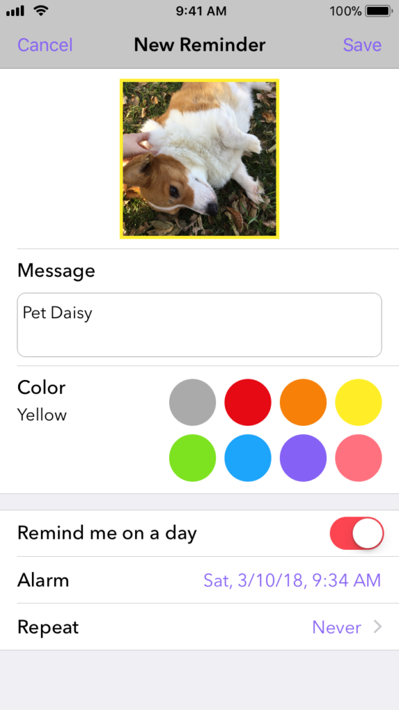
Bear in Mind
Bear in Mind was the first personal (non-tutorial) project I ever started working on. It was going to be a visual reminder app. Instead of a table view with a list of phrases, its main screen was a collection view of circular photos. My primary reasoning behind it was that a photo might trigger a more vivid, emotional response in my brain, making me more likely to remember whatever it was I wanted to remember. Photos could be categorized by setting a colored border around them. In the future I wanted to add a voice reminder option, so that if you tapped on a photo, you’d hear yourself talking. For example, I could put a photo of my mom and a voice message that said “remember Mom’s birthday!” or something.
I could barely get the app to compile due to a million Swift conversion errors, however after commenting out a bunch of error-filled code, I was able to get it to run long enough to grab a screenshot.
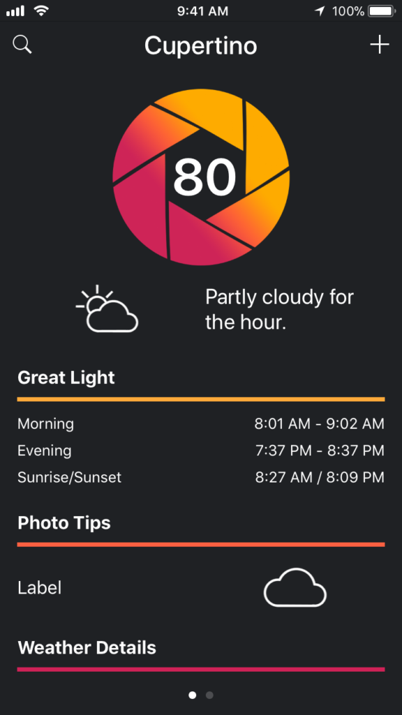
Cloudburst
Cloudburst was going to be a weather app for photographers. It would include the day’s conditions, when you could catch the best light, as well as daily tips and tricks. I abandoned Cloudburst after considering 1) the cost of maintaining a weather app and 2) the proliferation of similar apps on the App Store that were already pretty polished.
Lessons Learned
Both apps were great learning experiences. Bear in Mind was my first introduction to Core Data and scheduling notifications. Cloudburst was my first experience working with web APIs, UIPageViewController, and stack views. I also learned how to animate the opacity of views. Perhaps my most useful abandoned project was LiveRotate, my app for rotating Live Photos that I removed from sale prior to the release of iOS 10. I was able to use huge swaths of code from that app in Snapthread, saving me from reinventing the wheel.
You’ll notice I didn’t include my game, Corgi Corral, in this list. That’s because I refuse to acknowledge it as abandoned. I’m determined to get it on the App Store someday. I just need to completely re-do its core mechanics and make its icon and menu screen not look terrible, that’s all. Piece of cake! :)
I may not have been a complete novice when I sat down to create Snapthread, but it’s obvious I didn’t put much thought into its data model.
Basically, I created a class called “Video” which had properties like “asset” (for its AVAsset), “orientation,” whether or not it should be muted, its start time, duration, etc.
The flow from selecting videos to seeing a preview of them threaded together goes like this:
User taps on one or more videos and taps the “done” button
The PHAssets for the selected videos are passed to the main view controller by means of a delegate and stored in an array called “videoAssets.”
The videoAssets array is used for two things: 1) generating thumbnails for the video timeline and 2) fetching the actual AVAssets for all of the selected videos and wrapping them in the Video class. The Video objects are stored in a new array called “clips.”
You can already see a big problem here. I have two arrays to maintain: an array of PHAssets and an array of Video (containing the AVAssets). If a user re-orders videos in the timeline, I have to re-order both arrays. It’s mind-numbingly stupid.
It gets even dumber. I decided to add titles to Snapthread, so I added an enum called “VideoType” and just shoe-horned all the title stuff into the Video class. Now my “clips” array could have Video objects that were of type “.video” or “.title.” But wait, what about the array of PHAssets? I can’t create a PHAsset for a title card.
So, I shrugged and decided users could only add a single title at the beginning of the movie so that I could do stuff like “clips.remove[indexPath.item + 1],” taking into account the title card. It’s so, so gross.
Going Forward
My proposal for a new data model is to create a protocol called “Threadable,” which will cover any component of a user’s movie that can be added to the timeline. Whether it’s a video, title card, or still photo (which I may add support for in the future), it needs to give me two pieces of data:
a thumbnail representation of itself
an AVAsset to insert into the composition (for titles, this is a short blank video that’s included in Snapthread’s bundle)
All of the rest of the media-specific details will go in Video, Title, and (maybe) Photo classes. Then, I’ll have a single array of type “Threadable” which will be a million times easier to deal with.
I never really understood the benefit of protocols until this idea hit me the other night. Now I totally get it!


 Bear in Mind was the first personal (non-tutorial) project I ever started working on. It was going to be a visual reminder app. Instead of a table view with a list of phrases, its main screen was a collection view of circular photos. My primary reasoning behind it was that a photo might trigger a more vivid, emotional response in my brain, making me more likely to remember whatever it was I wanted to remember. Photos could be categorized by setting a colored border around them. In the future I wanted to add a voice reminder option, so that if you tapped on a photo, you’d hear yourself talking. For example, I could put a photo of my mom and a voice message that said “remember Mom’s birthday!” or something.