First of all, I’m incredibly excited to announce that Photos.app finally finished syncing my photo library to iCloud, after over two months (March 2 – May 8), leaving me with a “whopping” 7,359 photos and 104 videos. In related news, I’m willing to name my firstborn child after the first person to lay fiber all the way out to my farmhouse.
 And speaking of redesigned stock apps, I’ve also spent some time fiddling with the new Music app in the iOS 8.4 beta. I’m using the public beta build because even though I have a developer account, I feel slightly safer using the public betas on my primary devices. Anyway, I mostly like what they’ve done with the app so far, even though a few of the Known Issues are preventing me from using it normally (for instance, it’s not working correctly with the Philips head unit in my car). One thing I don’t like, however, is the size of the new mini player.
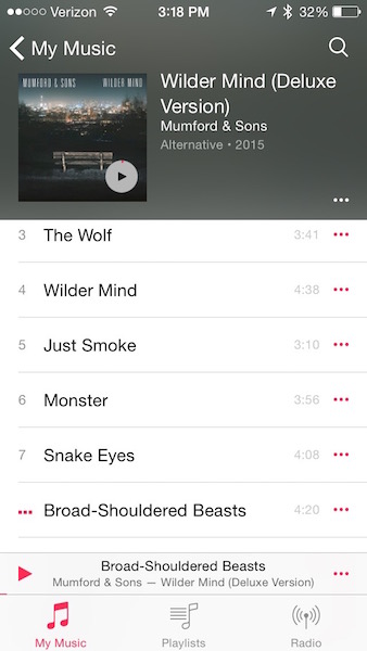
I’m generally not one to complain about the size of touch targets, but both the size and location of the mini player make it difficult for me to open it quickly. Whereas the “Now Playing” button in the upper right corner of the old music app was isolated from other tap targets, the new mini player is a skinny bar sandwiched tightly between the tab bar and your scrollable list of songs.
I’m not sure what the solution is here. Moving the mini player to the top would help isolate it, but would ruin the aesthetic that Apple is going for, with the color of the album artwork filling up the entire upper part of the screen. It would also make it harder for folks with the larger iPhones to reach the controls. Perhaps they could just increase the height of the bar to 44 points, the height of a normal table view cell.
I’m a big fan of the Beats Music app. I wish Apple would have borrowed its dark interface and––I can’t believe I’m saying this––its hamburger menu. I’d love it if they ditched the tab bar (but kept the “My Music” view as the default) and put playlists, radio, and anything else in a side menu. Then the mini player could sit at the bottom of the screen where it should be, just like the Beats app.
Finally, I wish they’d call it “Beats” instead of “Music.” All of this Music.app and Photos.app business is…odd. What’s next? FileSystem instead of Finder? Search instead of Spotlight? Let’s try to preserve some personality here, Apple!
Update 5/29/15: I’m used to the mini player now. I think it was just a muscle memory issue from using Beats so much! I still think I’d like it better if it sat at the bottom of the app though. :D